

Growth2 min read
Instagram Aesthetic Feed — How to Plan a Beautiful Grid
Plan a cohesive Instagram aesthetic. Color palettes, grid layouts, planning tools, and visual consistency tips.
 StoriesFly Team
On this page
Why Aesthetic Matters
A cohesive Instagram feed makes a strong first impression. When someone visits your profile, a visually consistent grid signals professionalism and makes them more likely to follow.
Choosing Your Aesthetic
Color Palette
Pick 3-5 colors that represent your brand:
- Primary color (dominant in most posts)
- Secondary color (accent and variety)
- Neutral colors (backgrounds and text)
- Consistent filter or editing style
Visual Style
Choose a consistent approach:
- Bright and airy
- Dark and moody
- Minimal and clean
- Bold and colorful
- Warm and cozy
- Pastel and soft
Content Mix
Balance different content types:
- Photos (product, lifestyle, flat lay)
- Graphics (quotes, tips, infographics)
- Reels thumbnails (branded covers)
- Carousel covers (consistent template)
Grid Layout Strategies
Row by Row
Each row of 3 posts has a consistent theme:
- Row 1: Product, lifestyle, testimonial
- Row 2: Tip, behind-the-scenes, quote
- Repeat the pattern
Checkerboard
Alternate between two styles:
- Photo, graphic, photo, graphic
- Creates a balanced, rhythmic look
Column Layout
Each column has its own style:
- Column 1: Photos
- Column 2: Text graphics
- Column 3: Mixed content
Color Blocking
Group posts by color:
- 3-6 posts in similar tones
- Transition gradually to the next color group
Planning Tools
- Preview apps (Later, Planoly, UNUM)
- Canva for consistent templates
- Lightroom presets for photo consistency
- Brand style guide for reference
Tips for Consistency
- Edit all photos with the same preset
- Use consistent fonts in graphics
- Maintain similar brightness and contrast
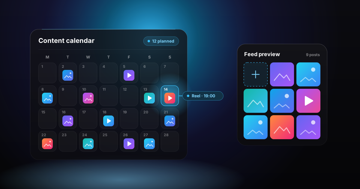
- Plan 9-12 posts ahead to see the grid
- Use branded templates for recurring content types
- Keep negative space consistent
Common Mistakes
- Obsessing over aesthetics at the expense of content quality
- Being too rigid (some variety is good)
- Not considering how reel covers fit the grid
- Ignoring stories aesthetic (use consistent story templates)
- Sacrificing posting frequency for perfect aesthetics